Button Panels
Overview
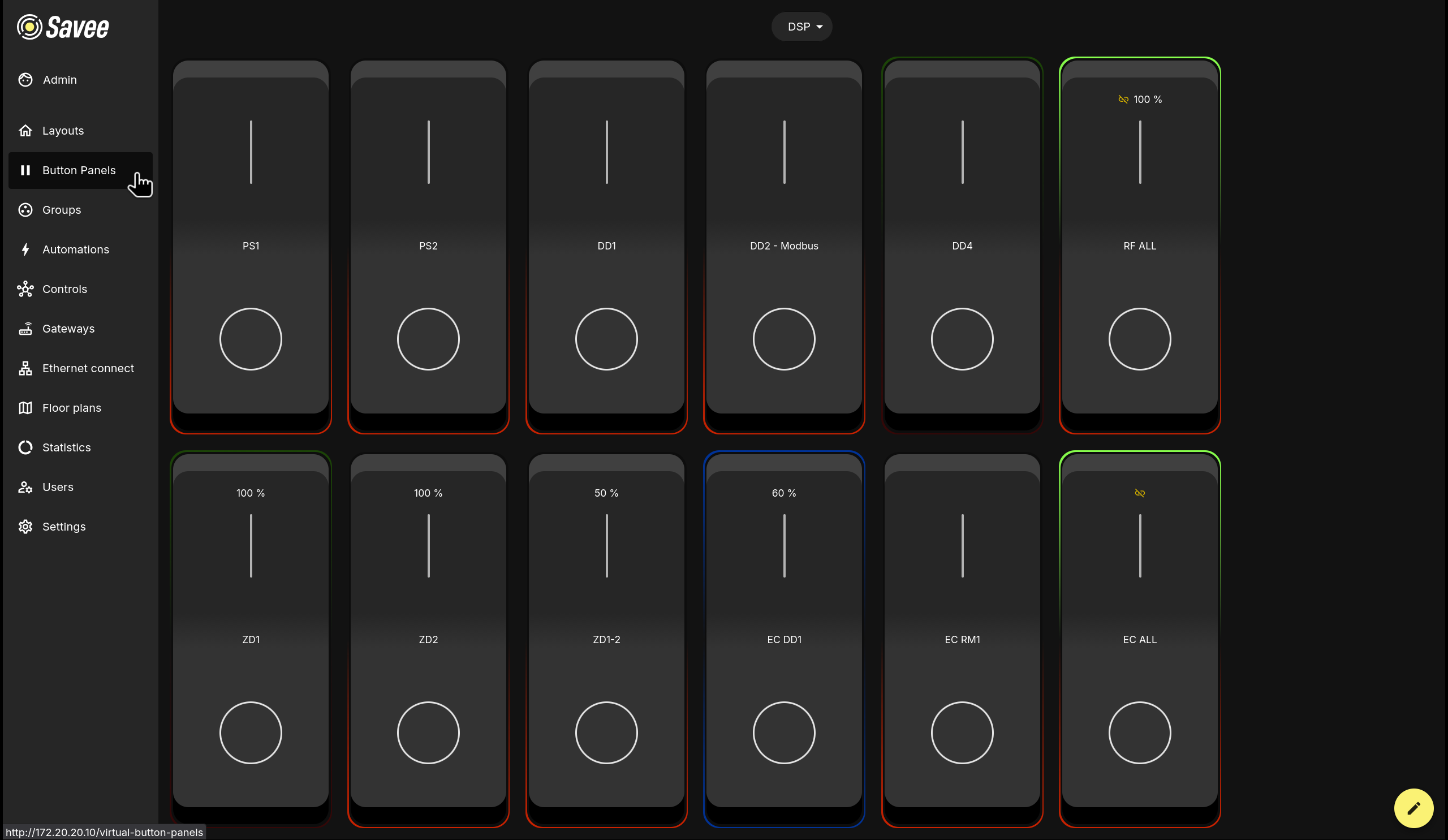
The Button Panels page provides a customizable interface of virtual buttons for controlling groups and automations. Panels are well-suited for use on tablets in kiosk mode as a clean, touch-friendly alternative to managing devices through lists or the map layout.
Each button card displays the device or group name, its current output level, a slider, and a toggle button. The border color of each card reflects the current state of the assigned device or group.
Button Border Colors
When Enable indication is turned on for a button, its border color reflects the live state of the indicated group:
| Color | Meaning |
|---|---|
| Green | Indicated group is on. |
| Red | Indicated group is off. |
| Blue | Indicated group is in automation mode. |
| Both green & red | Indicated group is in a desynchronized state. |
Managing Panels
Multiple button panels can be created to suit different rooms, floors, or use cases. The active panel is shown in the selector at the top center of the screen.
Click the panel selector to open a dropdown showing all existing panels and an + Add panel option.
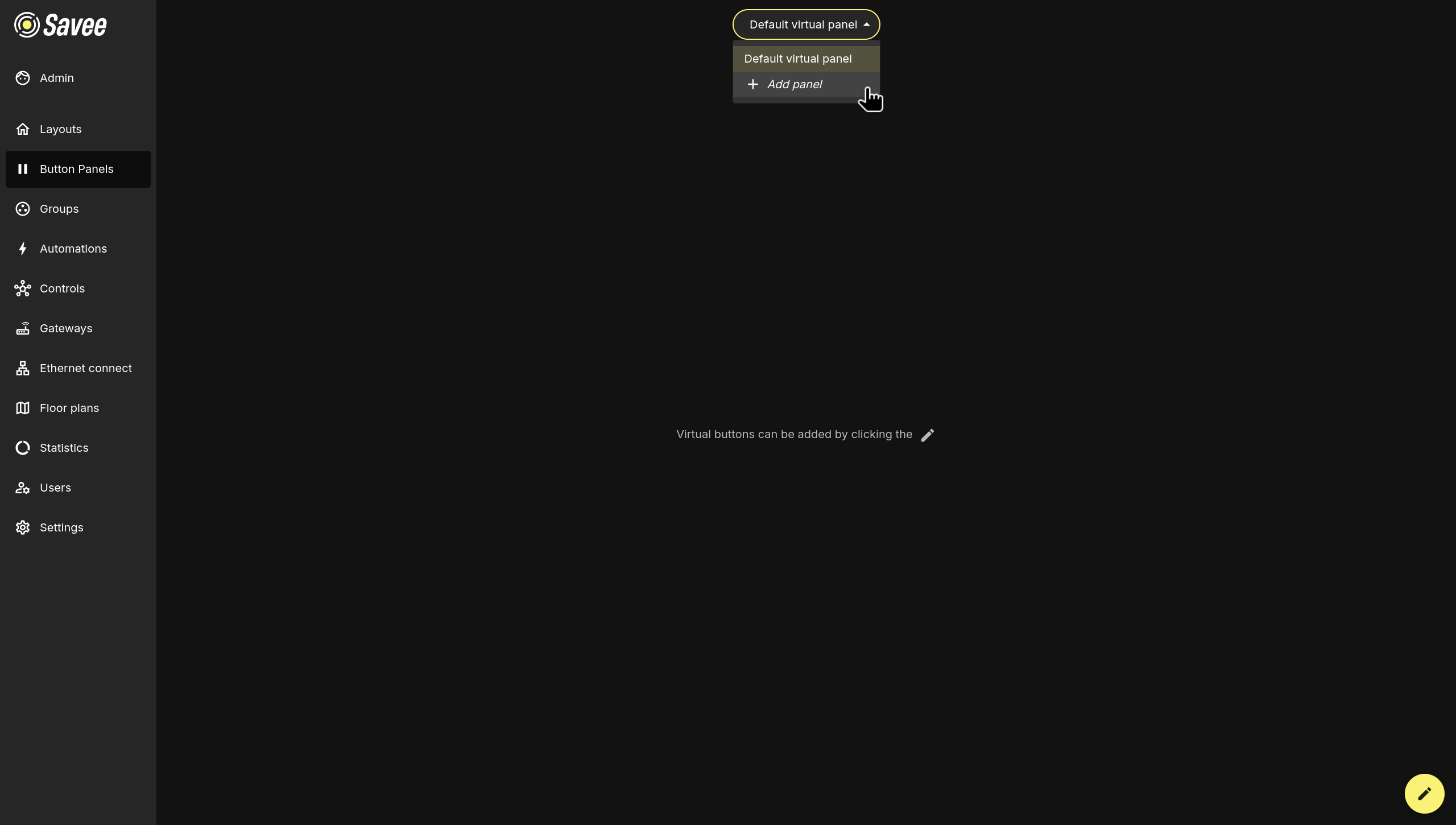
Tip
The default panel shown to each user can be set by an administrator. Navigate to Users, select the desired user, and adjust the preferred panel under the Default view setting.
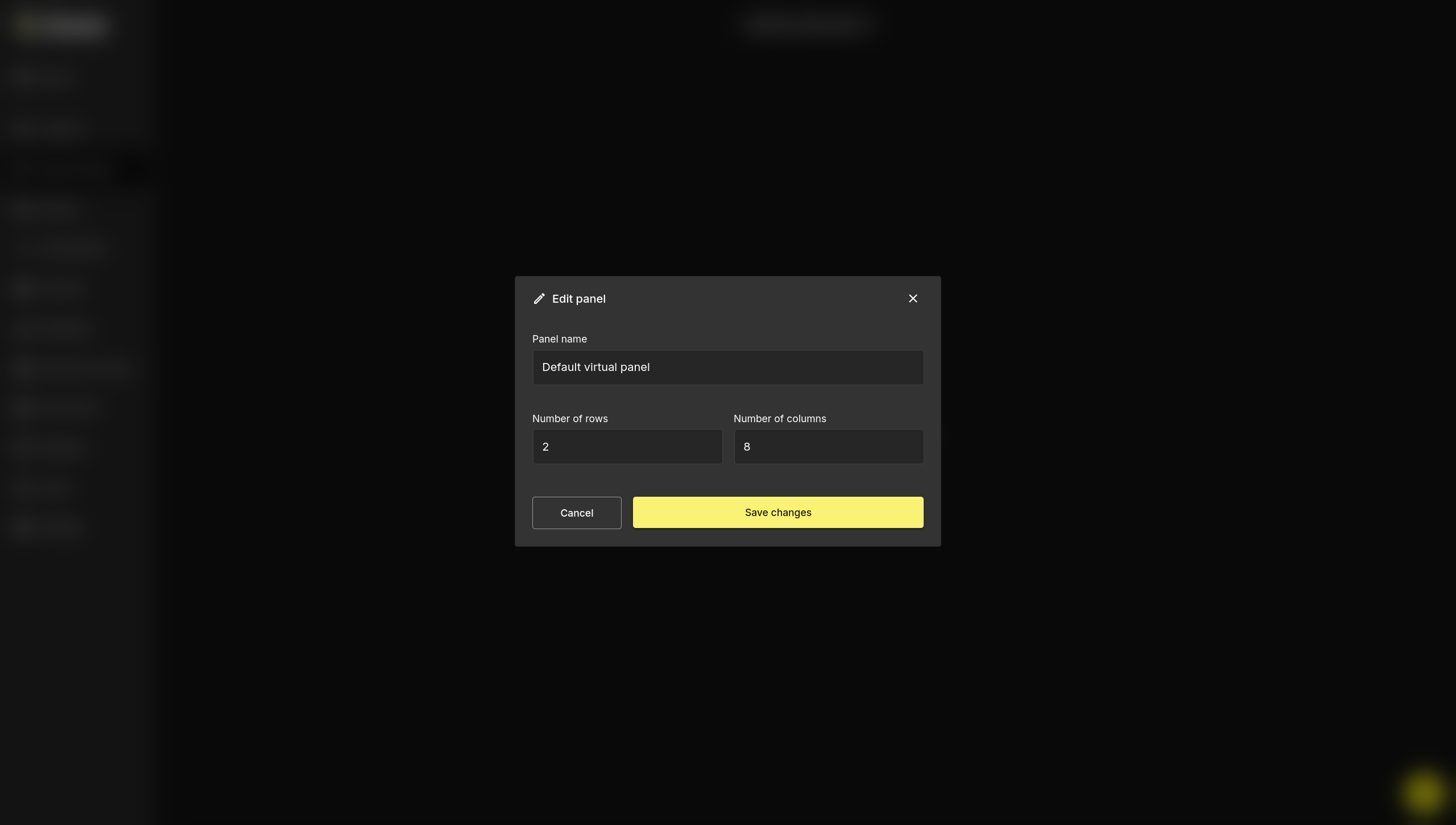
Editing Panel Settings
Clicking the pencil icon in the bottom-right corner brings up additional actions above the pencil:
| Icon | Action |
|---|---|
| Trash | Delete the current panel. |
| List | Reorder panels. |
| Crosshair | Move buttons within the panel. |
To rename a panel or change its grid dimensions, click the list icon after clicking on the pencil icon. The Edit panel dialog will open with the following fields:
| Field | Description |
|---|---|
| Panel name | The display name shown in the panel selector. |
| Number of rows | How many rows of button slots the panel contains. |
| Number of columns | How many columns of button slots the panel contains. |
Click Save changes to apply.
Edit Mode
The crosshair icon enables edit mode, which allows the user to add, remove or configure virtual buttons.
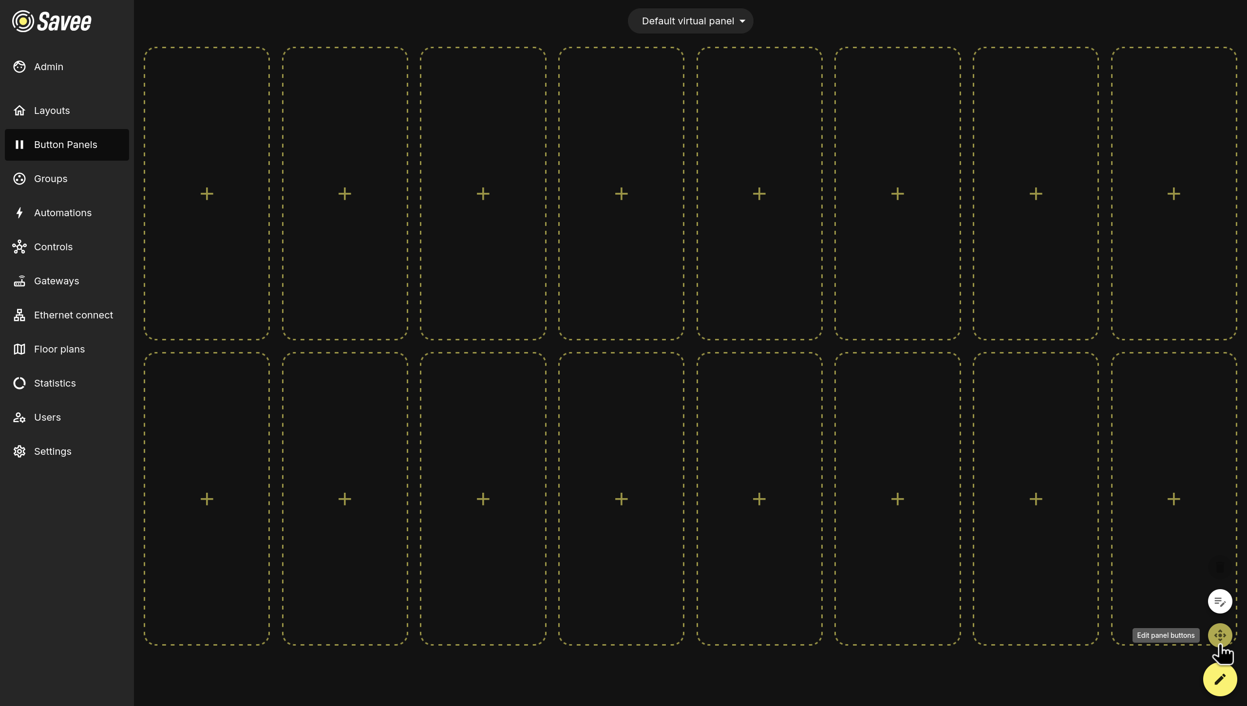
Adding and Editing Buttons
In edit mode, each empty slot displays a + icon. Click any slot to open the Add button dialog. Clicking an existing button opens the same dialog pre-filled with its current settings.
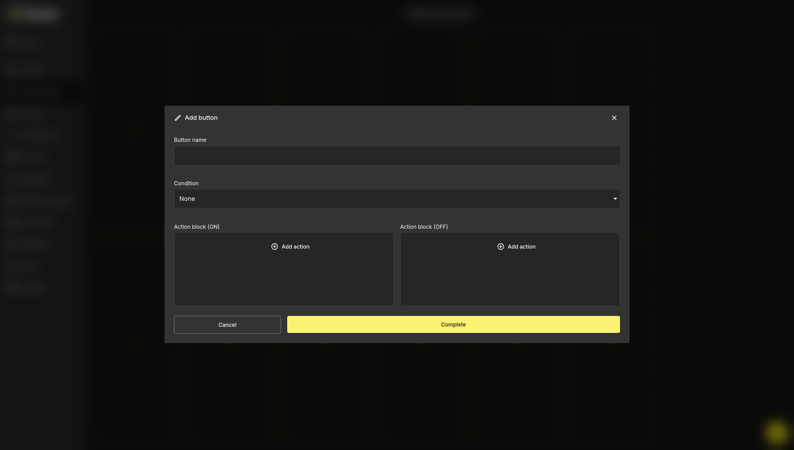
Button Name
A label that identifies the button on the panel.
Enable Interactivity
When enabled, the button supports a touch & hold interaction — holding the button and sliding allows the user to freely adjust the group's output level rather than applying a fixed value. For this to work, the corresponding action in the action block must also have its value set to Interactive.
Enable Indication
When enabled, the button's border color reflects the live state of a selected group, giving users a visual status indicator at a glance. Use the Indicated group dropdown to select which group the button should reflect.
Condition
An optional condition that restricts when the button's action blocks are executed:
| Condition | Description |
|---|---|
| None | The action blocks always execute when the button is pressed. |
| Time | Restricts execution to a defined time window. |
| Lux Range | Executes only when the lux reading of a control group is within a set range. |
| Select Automation On | Executes only if a specified automation in a group is active or inactive. |
| Any Automation On | Executes only if any automation in a group is currently active. |
| No Automation On | Executes only if no automation in a group is currently active. |
Action Blocks
Each button has two action blocks: Action block (ON) and Action block (OFF), corresponding to the two states of the button toggle. Each block can contain one or more actions executed when the button is pressed in that state.
There are three action types:
| Action | Description |
|---|---|
| Control Group | Sets a group to a specific output level (in steps of 10%) or to ON/OFF. |
| Automation | Turns a specified automation on or off for a group. |
| Override | Overrides all automations on a group for a set duration. |
Actions within a block can be given a delay relative to the previous action:
Example
- All actions with delay off → all actions execute simultaneously.
- Fourth action has delay on, set to
00:00:00→ it executes immediately after the first three complete. - Fourth action has delay on, set to
00:00:05→ it executes 5 seconds after the first three complete. - All actions have delay on, set to
00:00:00→ actions execute one after another in sequence.
Warning
When a button turns off an automation and then controls a device in that group, the device control action must be set as a second step with delay enabled (even at 00:00:00). If both actions run simultaneously, the system may try to control the device at the same time the automation is being disabled, causing unexpected results.
Click Save changes to save the button configuration.